
Arabic typography
Diacritics
Show or hide the vowel marks in Arabic text without retyping it, and give the marks a colour of their own.
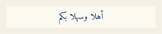
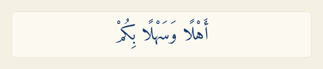
Diacritics, or tashkeel, are the small marks written above and below Arabic letters to show how a word is said: fatha, damma, kasra, sukun, shadda and tanwin. Most Arabic is written without them, but a verse, a text for children or a formal invitation often has them all. Liwan Studio lets you hide the marks a text already has, show them again, and draw them in a different colour from the letters.
How to show, hide and colour diacritics
Tap the text box whose marks you want to change, such as the welcome line of an invitation. A cursor appears in it.
The settings apply to the whole box, so you don't need to select any words. They work in both kinds of text box, the ones you make with Artistic Text and with Paragraph Text.
In the properties panel beside the page, tap Text in the row of tabs under Search properties, if it is not already open. Selecting text usually opens it for you.
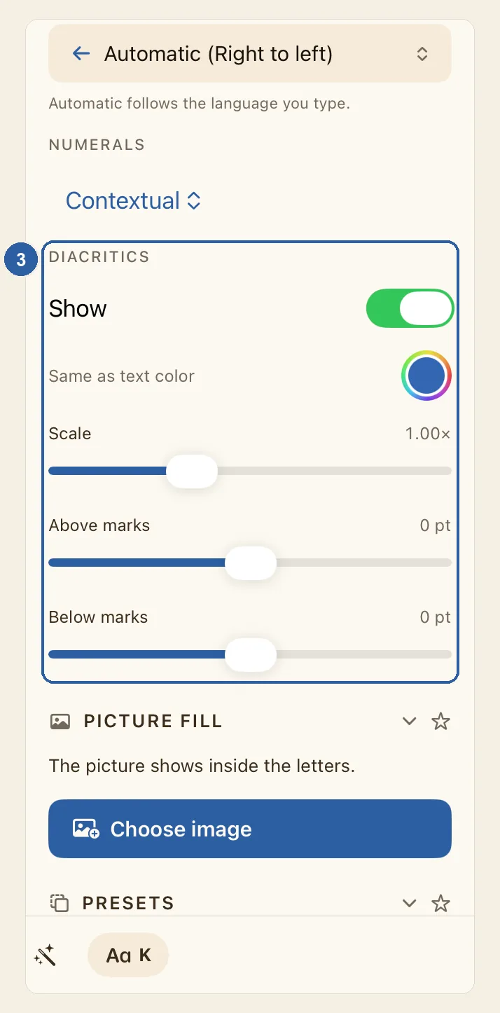
Scroll down the panel to the Appearance section. Diacritics is its last group, just below Numerals, marked 3 in the picture at the top of this page. If Appearance is folded away, tap its heading to open it.
If the text has no marks, the group shows only No diacritics in this text. Liwan Studio does not add marks for you: type them with the Arabic keyboard, or paste text that already has them.
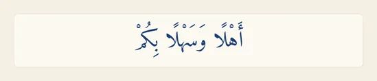
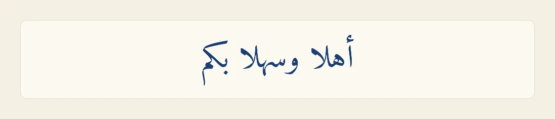
Turn off Show. All the marks disappear from the page, as in the picture below. A hamza that is part of its letter, as in أ or إ, is not a diacritic, so it stays.
The marks are not deleted. The text still holds them, and they come back as soon as you turn Show on again. While Show is off, the other diacritics settings are hidden from the panel.
With Show on, tap the round swatch with a rainbow ring next to Same as text color, and choose a colour in the picker that opens. The marks on the page take the new colour, the letters keep theirs, and the words beside the swatch change to Custom.
Until you choose a colour, the swatch shows a sample blue, not the colour of your text: the marks simply follow their letters. To go back to that, tap the round arrow that appears after the swatch (Reset to text color).
Tips
- Scale and Offset, below the colour, change the marks and leave the letters as they are. Scale makes the marks smaller or larger, from 0.50× to 2.00×. Offset moves every mark up or down by the same amount, up to 32 pt: a positive number lowers the marks, a negative number raises them. Once you have moved either slider, a Reset button appears below them; it puts both back to 1.00× and 0 pt.
- The settings are for the whole box. You can't hide or colour the marks of just one word.
- Only Arabic marks are affected, including the small signs used in Quranic text. Accents on Latin letters, such as é, stay.
- What you export looks like the page: hidden marks stay hidden, and coloured marks keep their colour. See Export.
- In a text box, the colour picker for the marks has no opacity setting.
- The Arabic presets turn Show on or off for you: Arabic Body, Arabic Headline and Quranic show the marks, Modern Arabic and Newspaper hide them. They don't change the marks' colour, Scale or Offset. See Arabic Presets.
- A look you save with Save style as preset…, under Presets further down the panel, includes these settings. They come back when you apply that preset to a whole text box.
- In a table cell, the cell's Text tab has its own Diacritics group while you type in the cell, with Show, Color, Size and Position. There, Position moves the marks up to 8 pt up or down. See Tables.
- Text typed inside a shape has no Diacritics settings.
- To jump to the right tab quickly, type "diacritics" or "tashkeel" in Search properties at the top of the panel, then tap the result.
- Every change can be undone, and a whole drag of a slider counts as one step. See Undo and redo.
Why it matters for Arabic text
Why it matters
Most Arabic is read without diacritics: a fluent reader knows from the sentence whether كتب means "he wrote" or "books". The marks matter where a misreading would be wrong — a verse of the Quran, a line of poetry, a name, a text for children or for people learning Arabic — and many people like them on a formal invitation. On a busy menu or a small sign, though, they crowd the lines and make small text harder to read.
Typing the marks takes time, so retyping a text with or without them is not a real choice. Liwan Studio hides the marks only when it draws the text: your words keep them, and one switch brings them back. A different colour, a slightly smaller size or a small nudge up or down lets you keep the marks for the reader without letting them compete with the letters.


