
Arabic typography
Arabic Presets
Give Arabic text a finished look in one tap: preview your own words in five ready-made presets, then apply the one you like.
A preset is a ready-made set of Arabic text settings that you apply all at once. It decides how much kashida (lengthening the joining strokes between letters) stretches the words, how the lines of a paragraph are justified, whether diacritics (the vowel marks above and below the letters) are shown, and which font features (OpenType) are switched on. Liwan Studio has five presets, and you see each one on your own text before you choose.
How to apply an Arabic preset
Tap the text box you want to change, for example the welcome line of an invitation. The text style bar slides up along the bottom of the editor.
A preset changes the whole box, so you don't need to select any words. It works in both kinds of text box, the ones you make with Artistic Text and with Paragraph Text.
In the text style bar, tap the magic wand button (Arabic presets). It comes after the alignment buttons and the book button (OpenType). In artistic text, the K button comes right after it. The Arabic Presets panel opens.
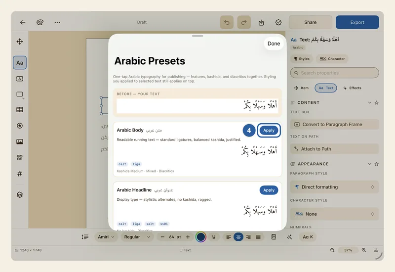
Compare the previews. At the top, Before — your text shows your text as it looks now. Below it is one card for each preset: Arabic Body, Arabic Headline, Quranic, Modern Arabic and Newspaper. Each card shows the preset's name in English and in Arabic, its Apply button, a short description, and your own words set in that preset.
The previews use the first few words of your text box, or the words you selected. Scroll down the panel to see all five cards.
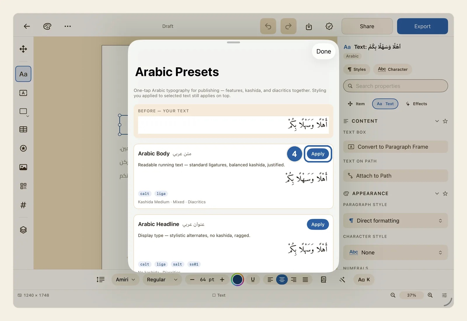
Tap Apply on the preset you like. The button marked 4 in the picture is the Apply button on the first card, Arabic Body.
Your text on the page changes straight away, the button changes to Applied, and the card gets a green border.
To try another preset, tap its Apply. It replaces the one before. When you are finished, tap Done to close the panel. To go back to how your text was, use Undo. See Undo and redo.
Tips
- What each preset is for:
- Arabic Body: longer text that people read through, such as the descriptions on a menu. Medium kashida, lines justified with kashida and wider spaces, diacritics shown.
- Arabic Headline: titles and big lines. No kashida, lines not justified, diacritics shown, and the font's alternative letter shapes if it has any.
- Quranic: the traditional look of the printed Quran (mushaf). Medium kashida, lines justified with kashida, diacritics shown.
- Modern Arabic: a clean, plain look. No kashida, lines justified by widening the spaces between words, diacritics hidden.
- Newspaper: narrow columns. Strong kashida, lines justified with kashida and wider spaces, diacritics hidden, and digits of equal width so prices and figures line up, if the font has them.
- A preset does not change your font, size or colour. Formatting you gave to selected words stays on top of it, as the note at the top of the panel says.
- If you select some words first, the previews show those words, but Apply still changes the whole box.
- A preset shows or hides the diacritics already in your text. It never adds any, and hiding them does not delete them. To show them again, apply a preset that shows them, or open the Text panel and, under Diacritics, turn Show back on. See Diacritics.
- Kashida works differently in the two kinds of text box. In artistic text, the preset sets the same level as the K button at the end of the text style bar, which then shows Med or High, or K when kashida is off. See Kashida intensity. In a paragraph text box, kashida is used only to justify the lines, so the one-line previews show no stretching there.
- How the lines are justified only matters in a paragraph text box. You can change it afterwards in the Text panel under Justification. See Kashida justification.
- A preset can only use what the font offers. If a font has no alternative letter shapes or no equal-width digits, that part of the preset changes nothing.
- The description on each card is in English, even when Liwan Studio is in Arabic. So are the grey line at the bottom of each card, which sums up the preset (for example "Kashida Medium · Mixed · Diacritics"), and the small tags such as liga and calt, which name the font features it switches on. See OpenType.
- If the text uses a paragraph style, the preset is added to each paragraph as a change on top of the style. The style itself stays as it was. See Paragraph Styles.
- The magic wand is not shown when you type in a shape or a table cell. Presets are for text boxes only.
Why it matters for Arabic text
Why it matters
Arabic text looks right when several choices agree: whether words are stretched with kashida, how the lines are justified, whether the vowel marks show, and which letter shapes the font uses. A verse set in the style of the mushaf, a newspaper column and a café headline each need a different mix. Setting each part by hand means visiting the K button, the OpenType panel and the Text panel one after another. A preset sets them together, and the previews let you compare the results on your own words before you change anything.