
Arabic typography
Kashida intensity
Give an Arabic headline a stretched, calligraphic look by lengthening the strokes that join its letters.
Kashida, also called tatweel, is the lengthened stroke that joins two Arabic letters: مطعم can be written مطـــعم. The K button adds kashida to a headline, and Liwan Studio chooses where to stretch it. Use it for the name on a shop sign, the title of a menu or the heading of an invitation.
How to stretch a headline with kashida
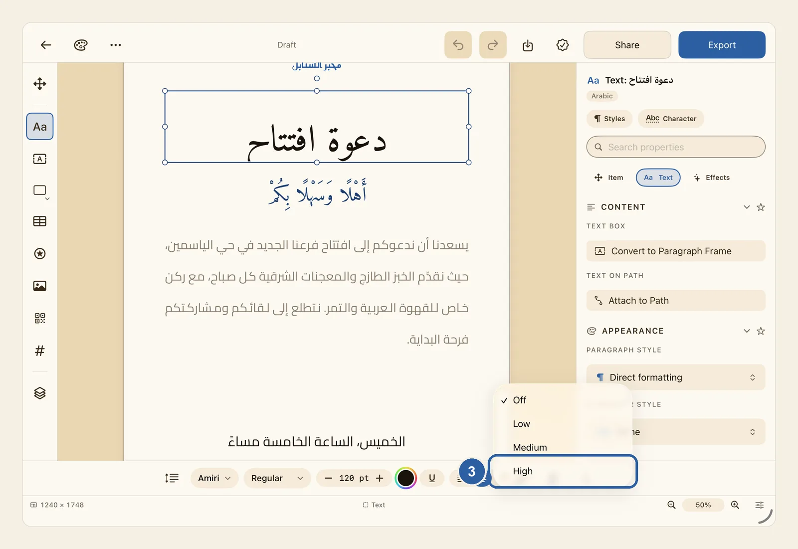
Tap the headline on the page. The picture shows the heading of an invitation, دعوة افتتاح, before any kashida.
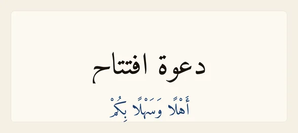
The K button works only on artistic text, the kind you make with Artistic Text in the tool rail. It always changes the whole box, so you don't need to select any words.
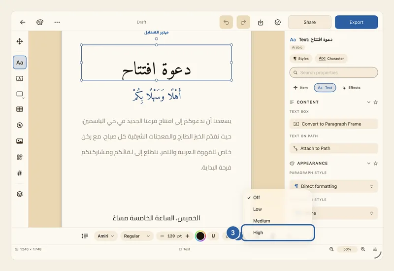
In the text style bar along the bottom of the editor, tap the K button at the end of the bar. When Liwan Studio is in Arabic, the bar is reversed and the K button is at its left end.
A menu opens with Off, Low, Medium and High. A tick marks the current level, which is Off for a headline without kashida.
Choose how much to stretch: Low, Medium or High. The picture shows the open menu, with Off still ticked.
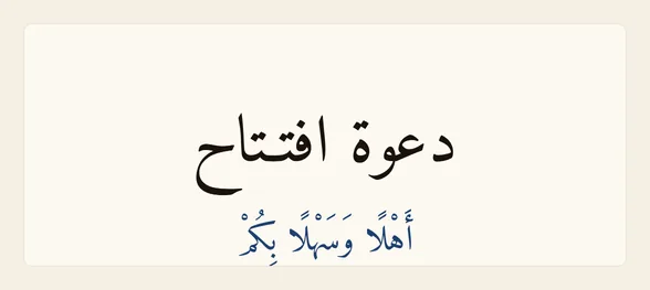
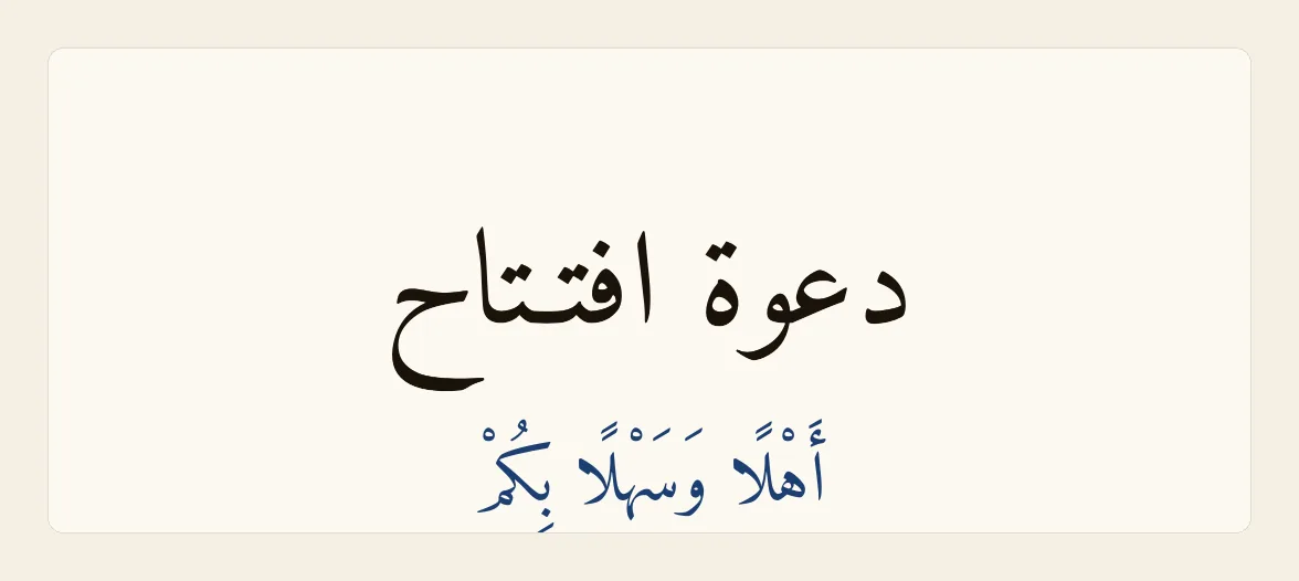
The headline then changes on the page. The next picture shows High: the join between the two ت letters of افتتاح is drawn out, and the headline has grown a little wider.
The K button is now filled with colour and shows the level you chose, Low, Med or High, instead of K. To compare levels, tap it again and choose another one. The headline changes each time, so you can keep the one that suits your design. To go back to the plain headline, choose Off.
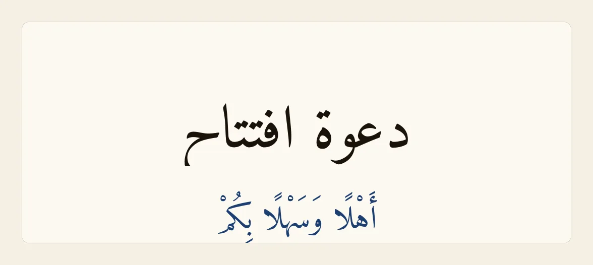
Tips
- What the three levels do:
- Low stretches only the places where it looks most natural, at most once in a word, with plenty of space between stretches.
- Medium stretches more places, still at most once in a word.
- High stretches the most, up to twice in a word, with the stretches closer together.
- Low is careful, so a short headline may not change at all. If nothing happens, choose Medium or High.
- Your words are not changed. The stretching is only drawn, so choosing Off brings back the headline exactly as you typed it.
- The box is resized to fit the stretched words, and a centred headline stays centred. If the headline becomes too wide for the page, choose a lower level or make the font smaller.
- Only Arabic letters that join are stretched. English words in the same headline stay as they are, and a headline in English does not change.
- If you tap the justify button, the last of the four alignment buttons, a headline gets the Medium stretch even while the K button still shows K. Choosing Off does not remove it; tap the left, centre or right alignment button instead.
- The K button is not in the bar for a paragraph text box. There, lines are stretched with kashida from the Justification setting in the Text panel. See Kashida justification.
- The K button is not shown for text in a table cell or inside a shape.
- Kashida is not applied to text on a path. See Text on Path.
- Applying an Arabic preset also sets this level. See Arabic Presets.
- If the window is too narrow for the whole text style bar, swipe the bar sideways to reach the K button.
Why it matters for Arabic text
Why it matters
Arabic letters join one another, so a word cannot be made wider by pushing its letters apart the way an English word can: the joins would break and leave loose letters. Calligraphers widen a word by lengthening the strokes that join its letters, and that drawn-out line is what gives a title, a sign or the heading of a certificate its breadth. Liwan Studio stretches only between letters that join, and, like a calligrapher, it prefers some letters to others: after ك and ل first, then after letters such as س and ص, then after letters such as ب and ت. It prefers the middle of a word to its first or last join, prefers longer words to short ones, and spreads the stretches evenly across the headline instead of piling them into one word.


