
Arabic typography
OpenType
Switch on the extras built into a font — ligatures, alternate letter shapes, stylistic sets and number styles — and see them on your own text.
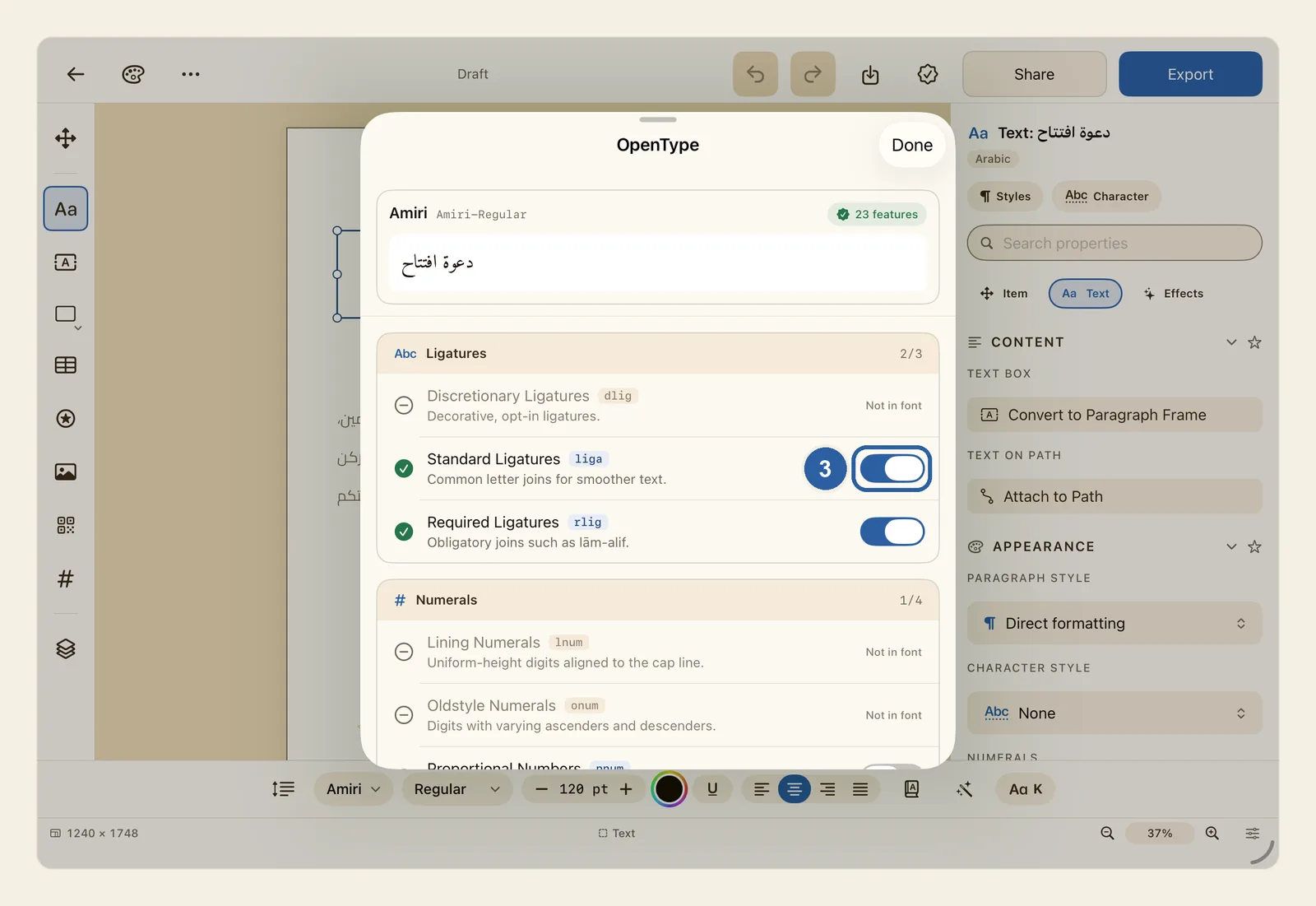
Many fonts carry extra letter shapes and options inside them, called OpenType features. A ligature, for example, joins two or more letters into a single shape, as lām and alif join in لا. The OpenType panel lists these features in plain words and lets you switch on the ones your font has.
How to switch on OpenType features
Tap the text you want to change. A cursor appears in it, and the text style bar appears at the bottom of the screen.
The features you switch on apply to the whole text box. To change only a few letters or words, select them now: double-tap a word, or press and hold on a word, then drag to select more.
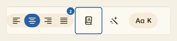
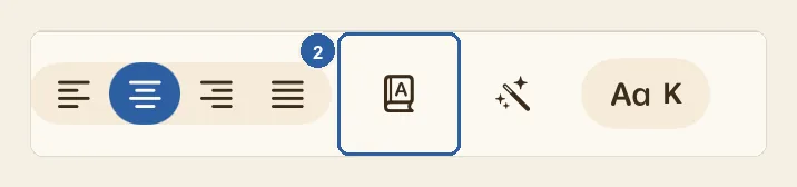
Tap the book button with a letter A on its cover, just after the four alignment buttons in the text style bar (2). Press and hold it to see its name, OpenType. When Liwan Studio is in Arabic, the bar runs the other way, so the button sits to the left of the alignment buttons.
The OpenType panel opens. At its top you see the name of the font your text uses, how many features are built into it, and a strip showing your text.
Find the feature you want in the list and tap its switch, like the one for Standard Ligatures, marked 3 in the picture at the top of this page. The features are grouped under Ligatures, Numerals, Alternates, Case, Position and Fractions; scroll down to see them all. Each one shows its name, a short code such as liga, and a line saying what it does.
Features your font does not have are greyed out and marked Not in font, with no switch. The numbers at the right of each group title, such as 2/3, tell you how many of that group's features the font has: here, 2 of 3.
On iPad the panel opens over the lower part of the screen. Drag the handle at its top upwards to see more of the list at once, as in the picture at the top of this page.
Look at the strip of text at the top of the panel. It shows the text the features apply to — your selection, or the whole box — drawn with the features you have switched on. It stays in place while you scroll the list, so you see each change as you make it. The text on the page changes too. If the text is long, the strip shows only its beginning.
When you are happy with the result, tap Done.
Tips
- Standard Ligatures and Required Ligatures are on from the start, as most fonts expect. Turning Required Ligatures off can break joins that Arabic needs, such as lām-alif (لا).
- Some features cannot be on together: only one of Fractions, Superscript and Subscript works at a time, and the same goes for Lining Numerals and Oldstyle Numerals, and for Tabular Numbers and Proportional Numbers. When you switch one on, Liwan Studio switches the other off for you.
- In most fonts, Fractions changes every digit in the text it applies to, not only the digits beside a slash. Select just the fraction, such as 1/2, before you switch it on.
- On a menu or price list, Tabular Numbers gives every digit the same width, so prices stacked in a column line up — if the font has it.
- Stylistic Set 1 to Stylistic Set 20 are in the Alternates group. What each set changes is up to the font's designer, so switch one on and watch the preview.
- The Numerals group in this panel changes the shape and width of digits. To choose between Western digits (0–9) and Arabic-Indic digits (٠–٩), use Numerals in the Text panel instead. See Numerals.
- If the panel says No OpenType layout tables in this font., the font has no extras to switch on. Fonts such as Amiri and Cairo have many.
- The number beside the font name counts every feature built into the font. Many of them, such as the ones that join Arabic letters, work on their own and are not in the list.
- To switch on a ready-made set of features together with kashida and diacritics settings in one tap, use the magic wand button (Arabic presets). See Arabic Presets.
- To get the same features wherever you use a style, set them in a paragraph style or a character style. A feature you switch on in the OpenType panel takes priority over the style. See Paragraph Styles and Character Styles.
- The panel also works for text inside a shape and in a table cell.
- When you copy text and paste it into other text in Liwan Studio, its OpenType features come with it.
- You can undo each switch. See Undo and redo.
Why it matters for Arabic text
Why it matters
Arabic letters change shape depending on where they sit in a word, and some pairs, such as lām and alif, must join into one shape. Fonts do this through OpenType. Liwan Studio applies the features that join and shape Arabic letters on its own — they are not in the list, so you cannot switch them off here by mistake — and keeps Required Ligatures on from the start.
The switches add what is optional. Some Arabic headline and calligraphic fonts include alternate shapes for certain letters, under Stylistic Alternates and the stylistic sets. Switching one on can give a headline or a shop name a different, more calligraphic look without changing the font.