
Arabic typography
Kashida justification
Justify Arabic lines by extending letter connections instead of widening the spaces between words.
Justified text fills every line of a paragraph from one edge of the box to the other. Kashida, also called tatweel, is the lengthened stroke that joins two Arabic letters: جميل can be written جمـــيل. With kashida justification, Liwan Studio fills each line by drawing out some of these joins, so wide gaps do not open up between the words. Use it for running text, such as the descriptions on a menu or the wording of an invitation.
How to justify with kashida
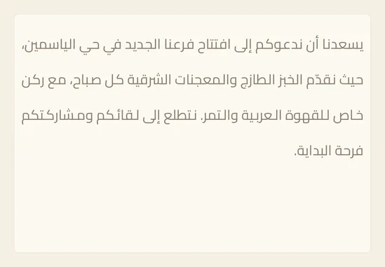
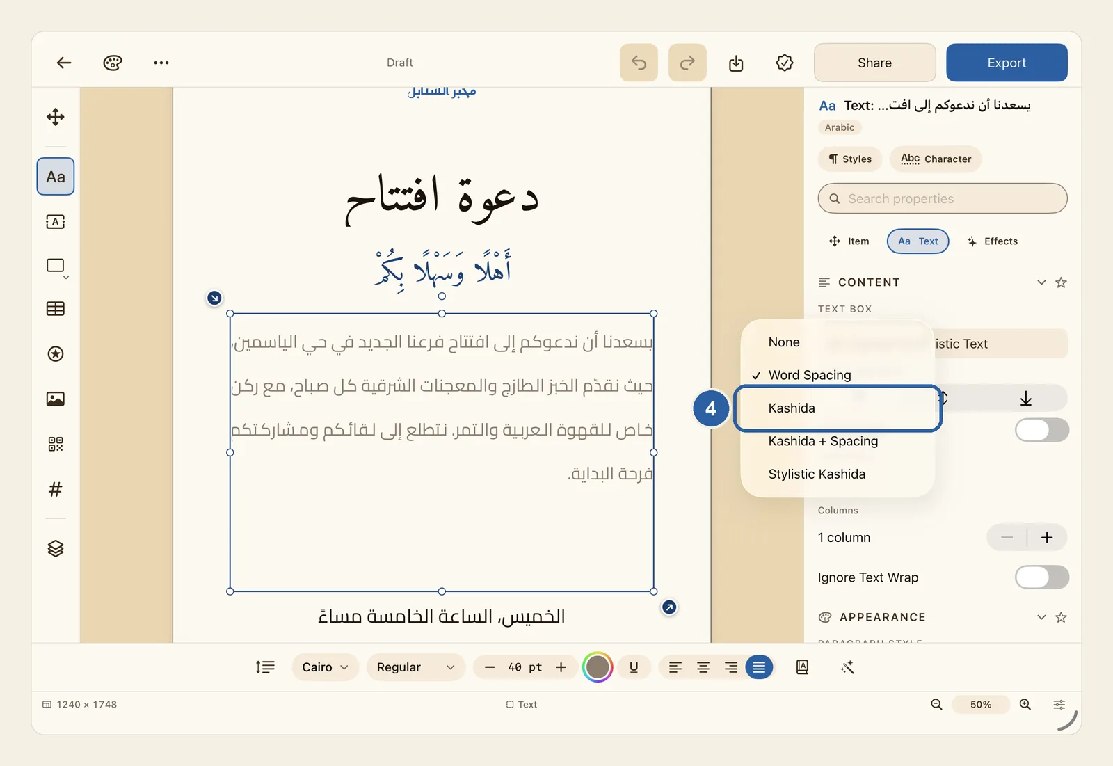
Tap the paragraph box on the page. The picture shows the paragraph of an invitation justified with Word Spacing: every line reaches both edges, but some of the spaces between the words have grown wide.
Tapping the box puts the cursor in the text. The change you make in step 4 then applies only to the paragraph the cursor is in, or to the paragraphs your selection runs across. If the box holds several paragraphs and you want them all justified the same way, tap Item (Box), the four-arrows button at the top of the tool rail, to stop typing. The box stays selected, and on an iPad without a keyboard the on-screen keyboard goes away.
Only paragraph boxes, the kind you make with Paragraph Text in the tool rail, have the Justification setting.
In the panel beside the page, tap Text at the top. Under Content, find the Text Box group. If Content is folded away, tap its heading to open it.
If the group starts with Convert to Paragraph Frame instead of Convert to Artistic Text, the box holds artistic text, which has no Justification setting. For a headline, use the K button instead — see Kashida intensity. Or tap Convert to Paragraph Frame to turn the box into a paragraph box.
Tap the menu under Justification. It shows how the paragraph is justified now: Word Spacing in our example, or None if the paragraph is not justified.
A list opens with five choices: None, Word Spacing, Kashida, Kashida + Spacing and Stylistic Kashida.
Choose Kashida in the list, marked 4 in the picture.
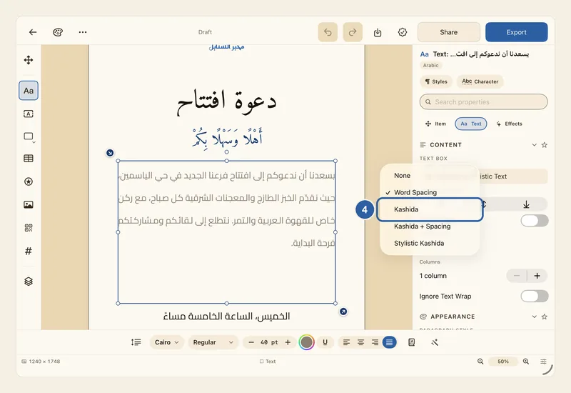
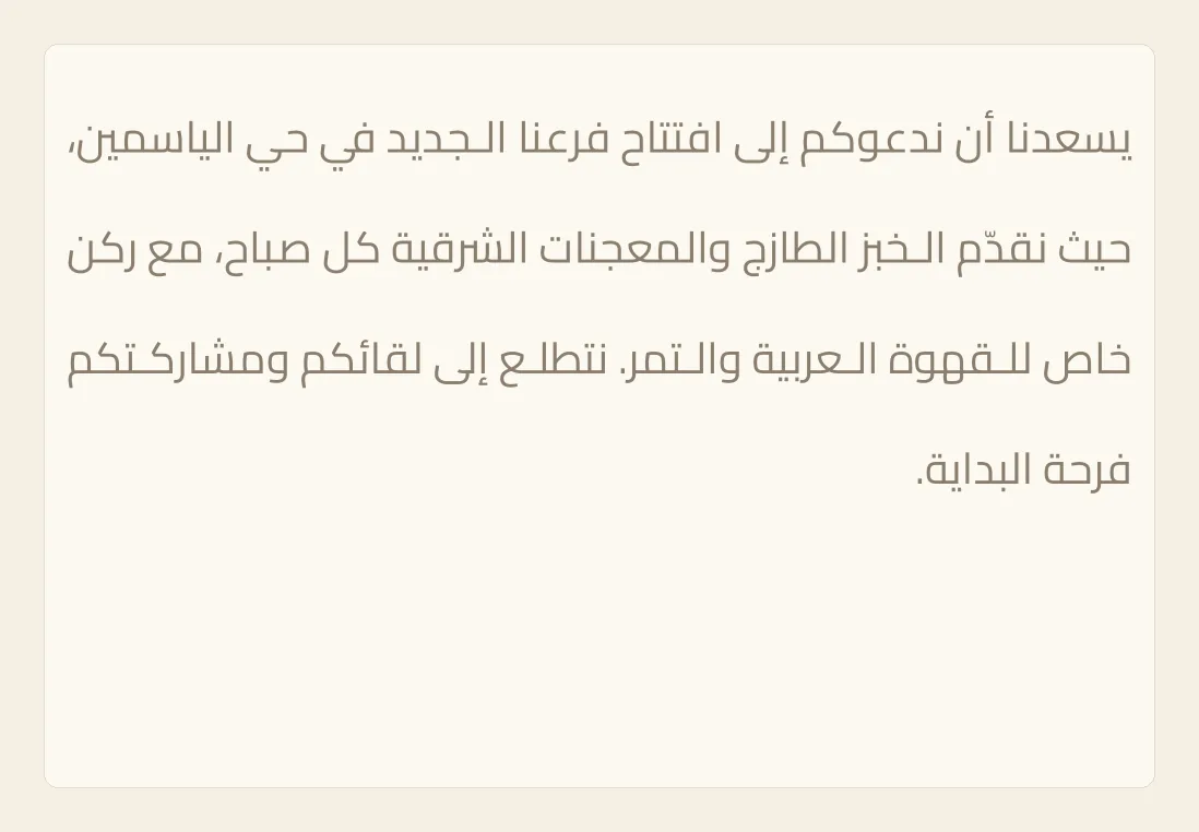
The menu now reads Kashida, and the paragraph on the page changes straight away.
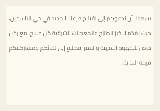
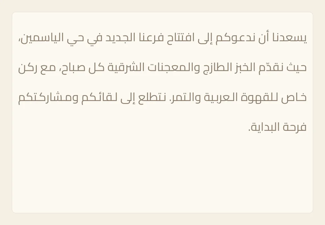
The lines still reach both edges of the box, but the extra width now goes into the words themselves. In the picture, الجديد has become الــجديد and العربية has become الــعربية, while the spaces between the words stay close to their usual size. The last line, فرحة البداية, is not stretched.
Tips
- What the five choices do:
- None: the lines are not justified, so their ends do not line up.
- Word Spacing: widens the spaces between words. This suits English text.
- Kashida: lengthens the joins between letters, as on this page.
- Kashida + Spacing: shares the extra width, with most of it going into kashida and the rest into wider spaces.
- Stylistic Kashida: first swaps some letters for wider shapes of the same letters, if the font has them, then adds kashida for what is left. With a font that has no wider shapes, it works the same as Kashida.
- The last line of a paragraph is never stretched. A very short line, one that fills less than 40% of the width available to it, is also left as it is, so that it is not pulled too far.
- A line with nothing to lengthen, such as a line of English words, gets wider spaces instead.
- The justify button, the last of the four alignment buttons in the text style bar, also justifies a paragraph. If Justification is set to None, the button chooses Kashida + Spacing for Arabic text and Word Spacing for English. If you have already chosen Kashida, it keeps your choice.
- Tapping the left, centre or right alignment button in the text style bar stops justifying the paragraph, and Justification goes back to None.
- Liwan Studio works out the stretching again whenever you change the words, the font or the width of the box. The words you typed are not changed.
- To justify all your body text the same way, use Justify in a paragraph style. It has the same five choices. See Paragraph Styles.
- Text in a table cell has its own Justify menu with the same choices, under Paragraph in the cell's Text tab. See Tables.
- For a headline made with Artistic Text, use the K button at the end of the text style bar instead. See Kashida intensity.
- Applying an Arabic preset also changes Justification: Quranic sets Kashida, and Arabic Body and Newspaper set Kashida + Spacing. See Arabic Presets.
- You can undo the change. See Undo and redo.
- In Split View or a narrow window on iPad, the panel is hidden to leave room for the page. Tap Item (Box) at the top of the tool rail to open it.
Why it matters for Arabic text
Why it matters
Arabic letters join one another, and Arabic has long had its own way of filling a line: lengthening the joins inside the words. Calligraphers and printers justified the lines of books and of the mushaf this way, so every line came out the same width without gaps opening between the words. Widening the spaces alone, the way English text is justified, leaves holes in the paragraph and breaks the flow of the writing, most of all in a narrow box. Liwan Studio stretches only between letters that join, spreads the stretching along the line instead of piling it into one word, and leaves the last line of each paragraph alone.


